
Wavelength
Overview
Wavelength is an online education resource where students looking for help studying can find potential study partners and set up virtual or in-person study sessions that fit around their schedule and needs. This project was done as part of Google's UX Design Certification course.
The primary focus of this project was to design an easy and efficient way for users to find study partners and schedule study sessions. A secondary goal was to make the design responsive so that it could work for both mobile and desktop formats. This project was also done in Adobe XD as opposed to Figma in order to help us learn how to use other design tools.
Role
UX Designer / UX Researcher / Visual Designer
Project Duration
May 11, 2021 - Jun 01, 2021


Understanding the Problem
In order to understand the users I was designing for, I conducted interviews with several participants and created empathy maps after gathering their feedback. Some pain points I identified through these interviews included users having difficulty finding study partners able to work around one another's schedules as well as non-English speaking users struggling to find partners whom they could effectively communicate with.
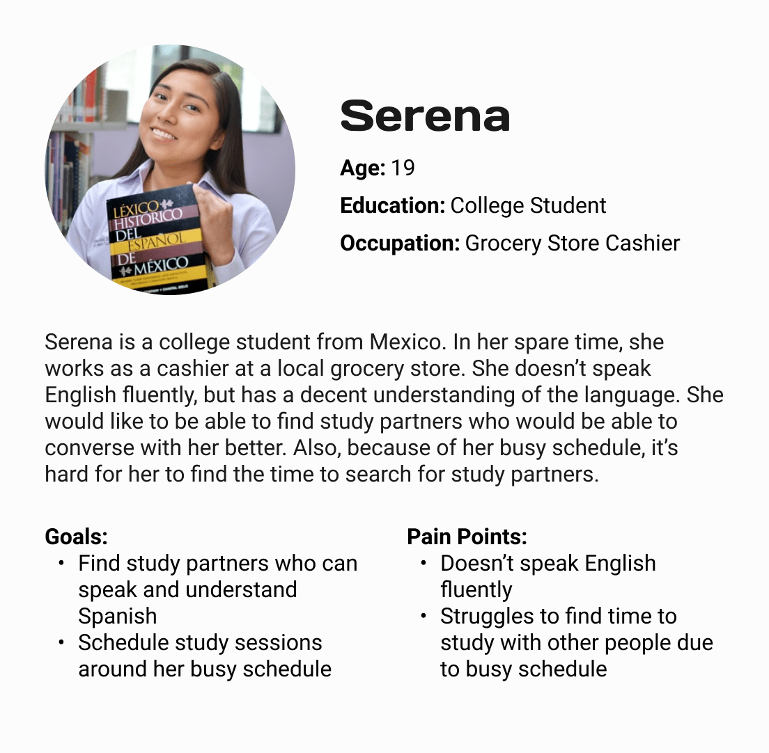
My user research lead to the creation of two user personas that I used to help refine and pinpoint my design to work on specific needs. These two personas included Marcus, busy college student having trouble finding people to study with due to his hectic schedule, and Serena, a Spanish-speaking student who often struggles to find people she can effectively communicate with. By creating these user personas, I was able to define the issues my users faced most prominently and target them with my design.
The discovery phase of my design process also included a competitive audit of competitors in order to determine specific features and design choices that worked or didn't work. The competitors I researched in this step were StudyBuddy, MOOCLab, Studypal, and Chegg Study. One constant I discovered during my competitive audit of these competitors was that a majority of their sites and apps were clunky, disorganized, and contained outdated visual design -- all pitfalls I wanted to avoid. By performing this audit before designing anything, I was able to figure out certain design elements that I wanted to include and those I wanted to avoid.


Brainstorming Ideas
The next step of my design process consisted of brainstorming various ideas of design solutions. During this step, I used the Crazy 8's method to quickly come up with several design solutions. Using the Crazy 8's method was beneficial because it was low stakes and allowed me to brainstorm multiple ideas in a quick and efficient manner without having to think too hard about it.
Another brainstorming method I used during this phase was creating a mind map. By building a mind map, I was able to come up with several design features I could have chosen to include in my final site design. This was beneficial because it let me keep my thoughts organized especially as I expanded upon my ideas more and more.


Designing the Solution
With the research and ideation phase completed, I began sketching out my design ideas on paper wireframes. AFter drafting several sketches of each screen, I selected design elements from each iteration that I liked the most and combined them to create more refined paper wireframes. Because a goal of the project was to make the site responsive, I sketched two sets of wireframes -- one for mobile and another for desktop. During this step, I sketched out the desktop designs first then translated them into mobile format so that I could figure out what elements I wanted to prioritize and how to display them on mobile.
After finalizing my paper wireframes, I moved onto low-fidelity wireframes and connected them to build a prototype. As with my paper wireframes, I built lo-fi wireframes of my design in both mobile and desktop format.


Validating the Design
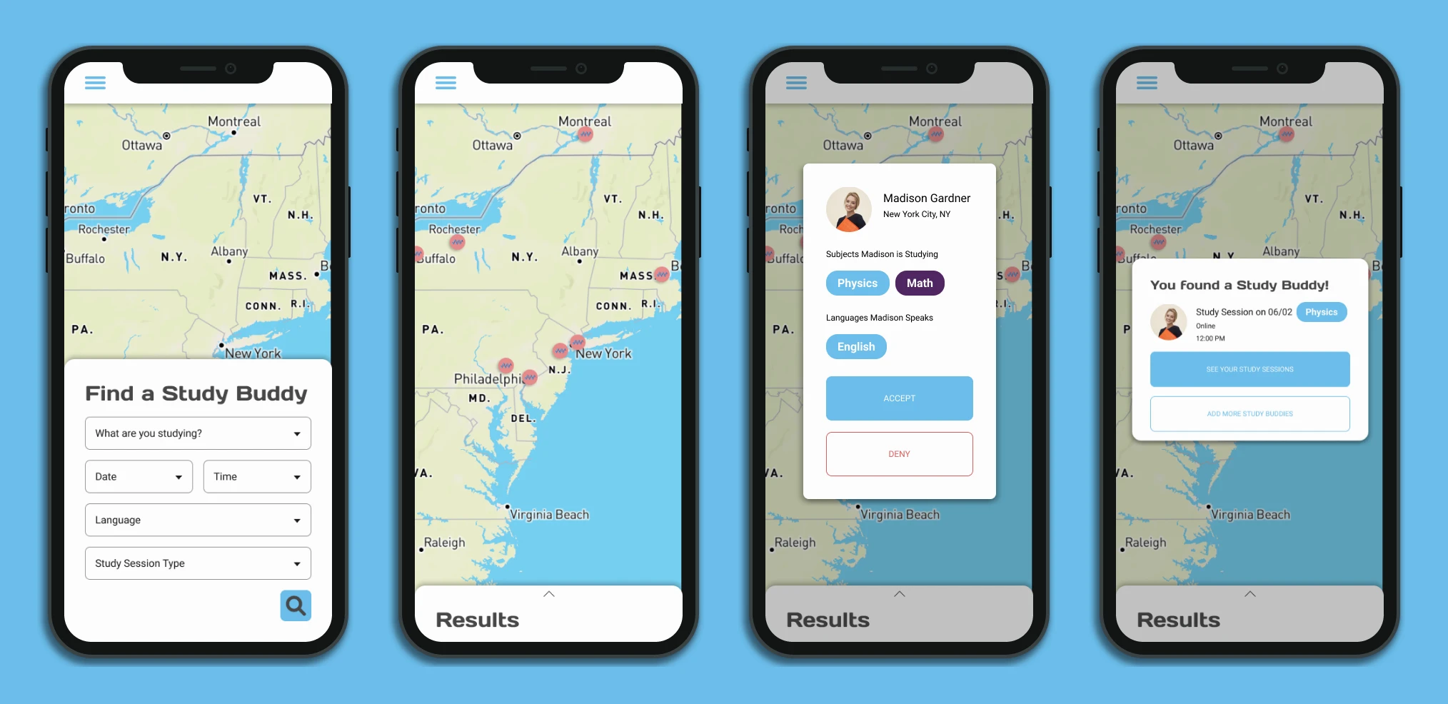
To test my prototype, I conducted a moderated usability study where I instructed participants to use Wavelength's study partner request flow. For this study, I gathered a group of participants who ranged in age and gender; the one variable I wanted to control was to find at least one participant who did not speak English fluently. The goal here was to determine how easy or difficult it was for participants to find and request study partners. I also wanted to determine the responsiveness of my designs and determine which design elements worked well in regards to mobile and desktop formats so I had participants test both versions of the prototype.
From the results of this usability study, I discovered three insights: users needed a better way to visualize when their study sessions are and what subjects they will be studying during these sessions; users wanted the ability to meet up in-person as well as online; and users wanted the ability to create groups of multiple study partners as opposed to studying with only one other person.
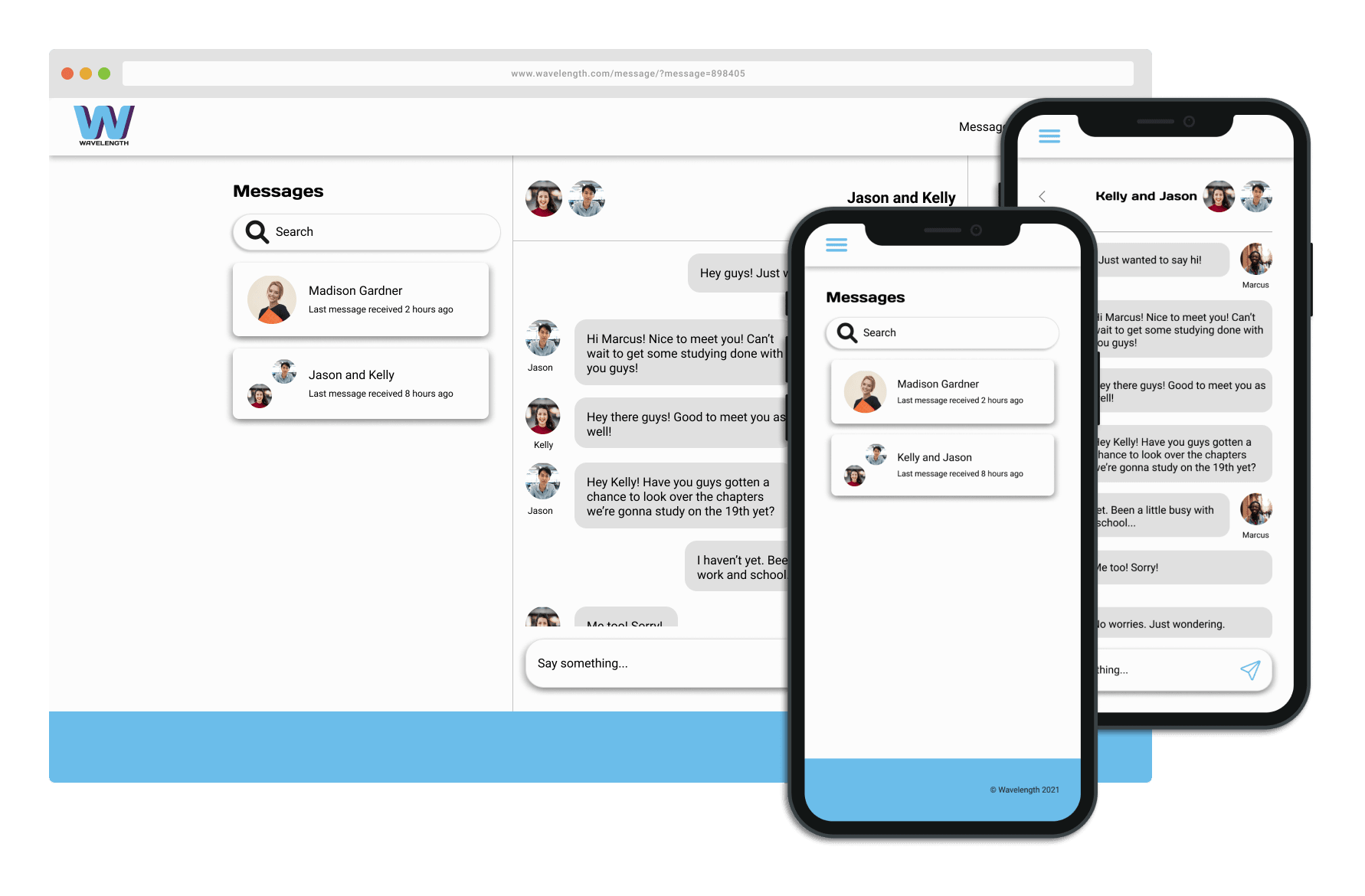
In order to target the problems raised by the insights gathered from my usability study, I refined my low-fidelity wireframes and further fleshed out the site, such as adding a chat feature that users could use to communicate with one another. I also added the ability for users to filter out study partners based on the langauges they spoke in order to be more accessible towards non-English speaking users.


Delivering the End Product
Before building my high-fidelity wireframes, I designed a UI kit in order to make my workflow more quick and efficient. By desgning the components of the website atomically, I was able to settle on designs and refine them before testing them out on each different screen. This made my work much more productive because I wasn't designing things on the fly and redesigning them later in order to fit the overall design of the website.
After completing my high-fidelity wireframes and putting them together into a working prototype, I tested my design again in an unmoderated usability study. As opposed to the moderated study I conducted before, I wanted to use an unmoderated usability study so that I could test whether users could use the site's features without my instructions. At the end of this second usability study, I found that most users were able to complete the study partner request flow and that a majority of the study participants enjoyed the visual look of the site.


What I Learned
The primary thing I learned from this project was how to design responsively for both mobile and desktop formats. Having to design in these two different formats forced me to think more in-depth about how information would be presented and organized depending on the format. By building my wireframes first in both formats, it allowed me to think about the different ways certain design elements could fit each format.
This project also allowed me to get comfortable using Adobe XD. As primarily a Figma user, being forced to use Adobe XD was beneficial because it allowed me to get a better grasp for a different design tool.