
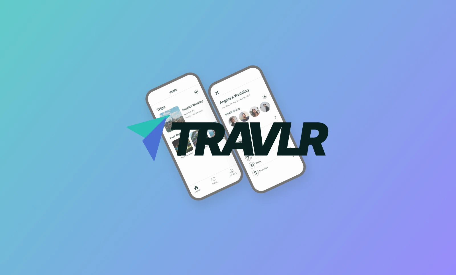
Travlr
Visit PrototypeOverview
Travlr is a travel planning app that helps users collaboratively plan group trips with multiple participants.
The goal of this particular project was to design an easily-navigable mobile app despite the many moving parts that comprise a group planning app.
Role
UX Researcher / UX Designer / Visual Designer
Project Duration
Jul 22, 2021 - Oct 19, 2021

Understanding the Problem
To gain a bit of perspective on this project, I conducted multiple interviews with people who often make travel plans with groups of friends or family. Through these interviews, I discovered several pain points users encountered while planning group trips. Primarily, I learned that travelers often found themselves frustrated due to a lack of order and communication between their fellow travelers. This lead to users being confused and travel plans being disorganized or incomplete.
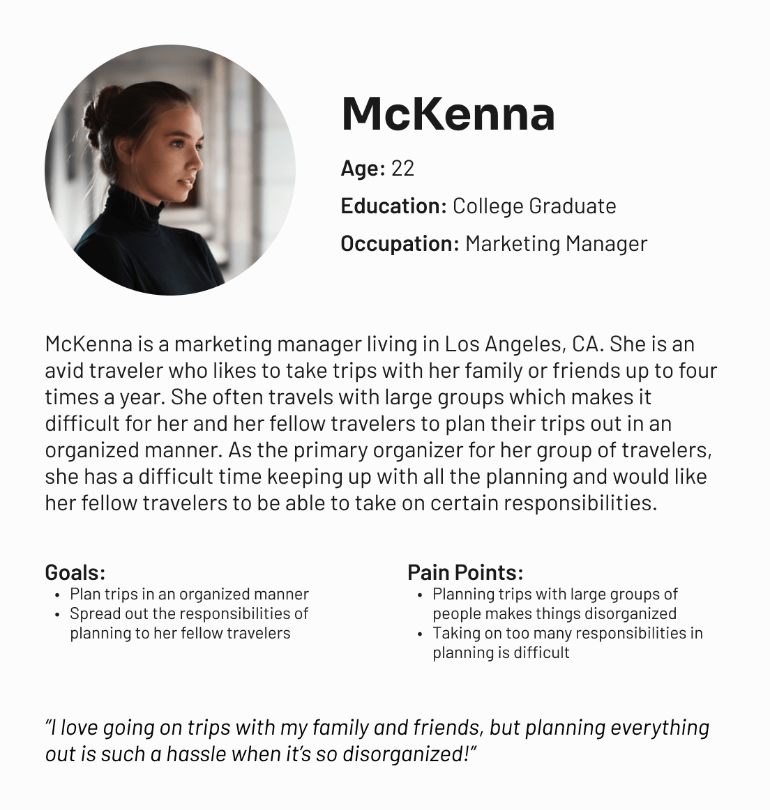
From my user research, I was able to develop two user personas -- McKenna, an avid traveler who likes to frequently take trips with her friends and family and is typically in charge of the planning, and Charles, a busy professional who tries to take at least one trip a year with his large group of friends, but often lets others do the majority of the trip planning. I took the insights learned from my user interviews and synthesized them to create these two user personas that I felt best showed the target users Travlr would be engaging with.
In an effort to better understand the intricacies of travel planning, I also researched several competitors and resources similar to Travlr. In this competitive audit, I researched Mobili, Tripit, and Kayak -- three competitors that also provided travel planning services. This audit revealed that the majority of these competing apps were disorganized and information within them was difficult to find. Furthermore, most of these competitors' apps were also visually unimpressive and looked rather outdated as well.


Brainstorming Ideas
The primary ideation technique I used for this project was the mind map method. I preferred to create a mind map for my ideas here because it allowed me be more organized with my thoughts especially since this project had so many different flows the user could take. Creating a mind map allowed me to further develop each user flow and expand upon them as much as I wanted.
Another ideation technique I used was the Crazy 8's method which allowed me to sketch out the ideas I already had from my mind map. By doing this, it gave me a better sense of how some of these ideas would appear visually.
Designing the Solution
The first step of the design phase involved me sketching out my ideas into paper wireframes. For this step, I created multiple variations of the same screen then later picked specific design elements that stood out the most and combined them to create a more refined paper wireframe for each specific screen. At the end of this phase, I had a complete paper wireframe showing each screen I wanted to build.
With my paper wireframes sketched out, I moved on to low-fidelity wireframes. Because Travlr contains so many extensive user flows I wanted to be able to prototype each one here. Thus, my first lo-fi wireframe was actually rather complex compared to ones I had designed before.
Validating the Design
To test my prototype, I conducted a moderated usability study during which I instructed participants how to complete various tasks, such as creating a group trip, adding fellow travelers, adding transportation and lodging details, collaborating with others on activities, and assigning specific tasks to certain group members. The goal of this usability study was to see whether the user flows made sense and determined how easy or difficult it was to complete these tasks.
This usability study resulted in several insights:
- The app was difficult to navigate and using tabs to navigate between certain actions was more distracting than intuitive.
- Better labeling was needed to avoid confusion.
- The trip page was cluttered and needed more organization.
This feedback received from my usability study showed me that my app design had a long way to go. It forced me to go back to the drawing board and come up with better ways to organize and structure my content as that seemed to be the most frustrating issue users faced here. While the study participants did enjoy certain features of the Travlr app, the majority of them felt that it could use more refining.


Back to the Drawing Board
After scrapping my initial lo-fi designs, I rethought my organization of the app and decided to keep most of the content organized by trip behind a list of links as opposed to having the user switch between tabs. This way, it would eliminate the confusion switching tabs may create. Hiding the majority of the content behind these links as opposed to keeping it all on one page also made the trip page more concise and less cluttered. Lastly, I completely eliminated the discover page which was meant to help users find activities to do while on vacation, but instead turned out to be distracting and unnecessary.
With my new lo-fi wireframes designed, I conducted a second moderated usability study. Like the first one, I instructed my participants to complete the same tasks and observed their reactions and feedback. From the results of this second usability study, I believe I made better decisions regarding the organization of content. The participants seemed more engaged and less confused during this usability study whereas they seemed lost and frustrated during the first one.

Delivering the End Product
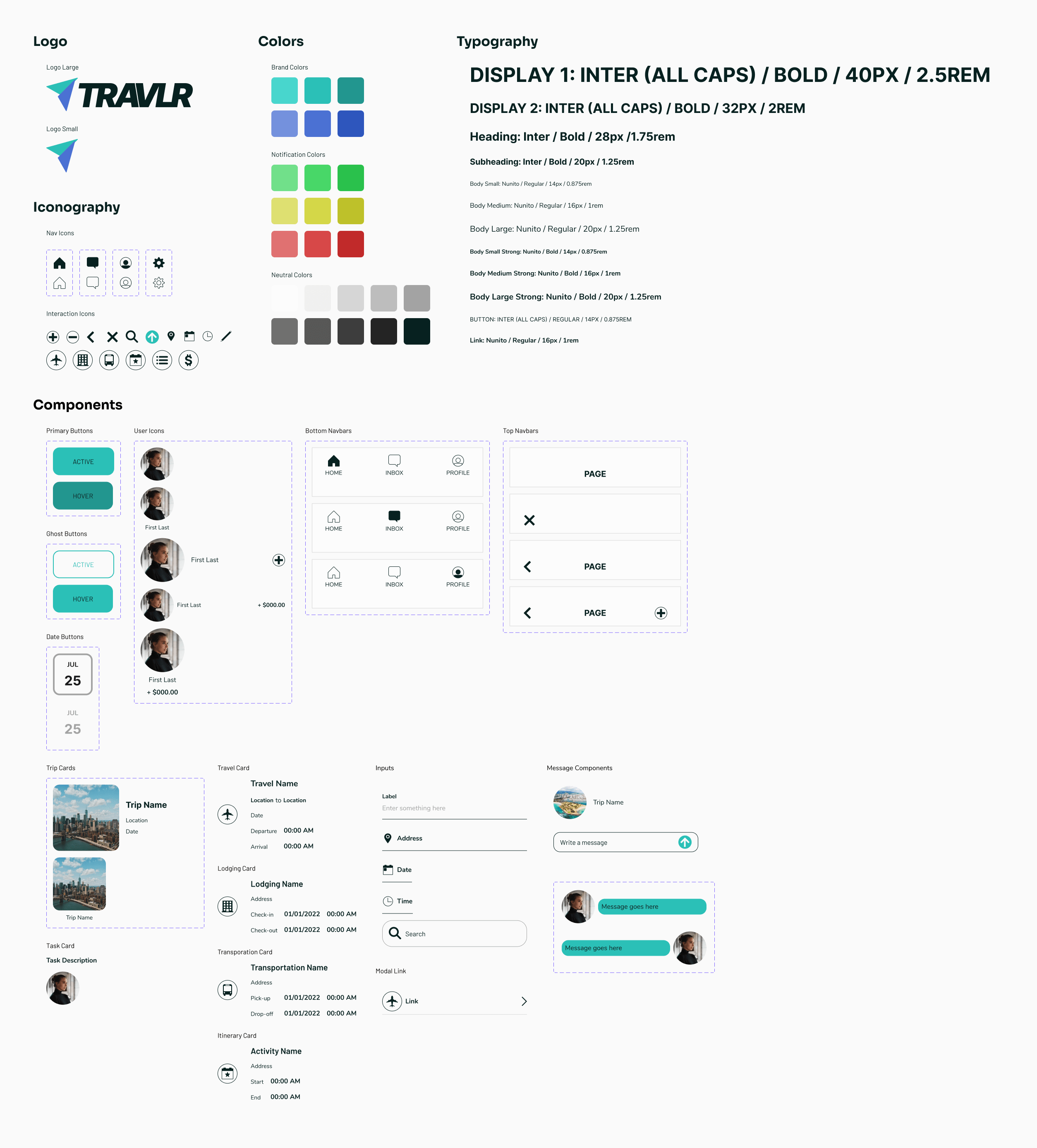
Before moving on to the high-fidelity wireframes, I created a UI kit that consisted of Travlr's brand colors, a typography system, custom icons, and various components I knew I would use throughout the app. By creating this UI kit beforehand, it made my workflow more productive and efficient.
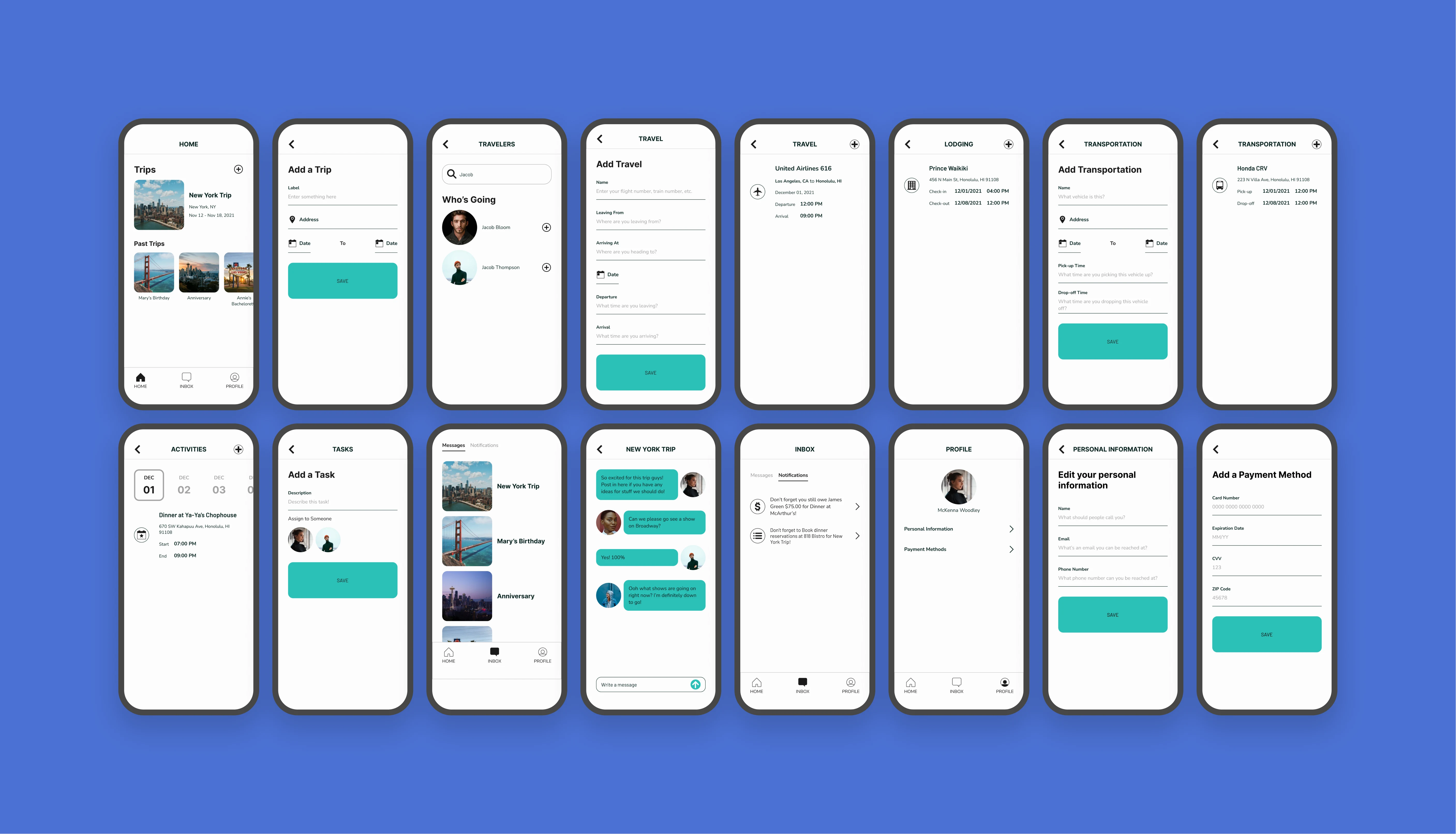
With my UI kit built, I started designing my hi-fi wireframes and connecting them to build a prototype. Due to the complex nature of this project, this was probably my most in-depth and involved prototype. It displays a variety of different user flows, such as creating a group trip, adding users to said trip, adding transportation, lodging, and activity details to each trip, paying and requesting money for certain expenses from other users, and communicating between group members.
To validate my designs, I once again conducted a usability study. This time, however, I chose to conduct an unmoderated study as opposed to a moderated one. With this study, I wanted to test how easy or difficult it was for users to complete those same tasks I had instructed my other study participants to do. The feedback I received in this usability study was rather positive with users commenting how easy an app like Travlr would make their group travel plans. One of the few negative comments I received about my hi-fi prototype was that it was visually boring as everything looked pretty similar. However, with the complex nature of the Travlr app, I felt this was a sacrifice that had to be made in order to reduce confusion and frustration.


What I Learned
The biggest thing I learned from this project was that your design is never perfect and that sometimes it's necessary to go back and rethink the design choices you've made. My first low-fidelity prototype received some very negative feedback, forcing me to think harder about how I was organizing my content. However, this also lead to a more structured app that was easier to use and navigate through.